
Talkdesk (2023)
Redesigning call automation to drive confidence and engagement at scale
THE PROBLEM: BUSINESSES AVOIDED CUSTOMIZED AUTOMATION
Talkdesk helps medium and large businesses engage with their customers efficiently. One key tool, the Dialer, automates calls to boost campaign efficiency. However, in 2022, it faced a critical adoption problem: users avoided the customization options they initially requested due to complexity, affecting the efficiency of 1.5 million calls each month. With growing support tickets and frustrated customers, the problem became a top priority.
How might we clarify how customization options work so users can start using them intentionally?
Team
1 PM, 1 tech lead, 5 engineers
Role
Owned the end-to-end design process
UNDERSTANDING WHAT WAS BLOCKING ADOPTION
Users experienced unclear information
Customization options were overwhelming, making it hard for users to understand how and when calls would be made. As a result, they didn’t feel confident about the outcome of their configuration.
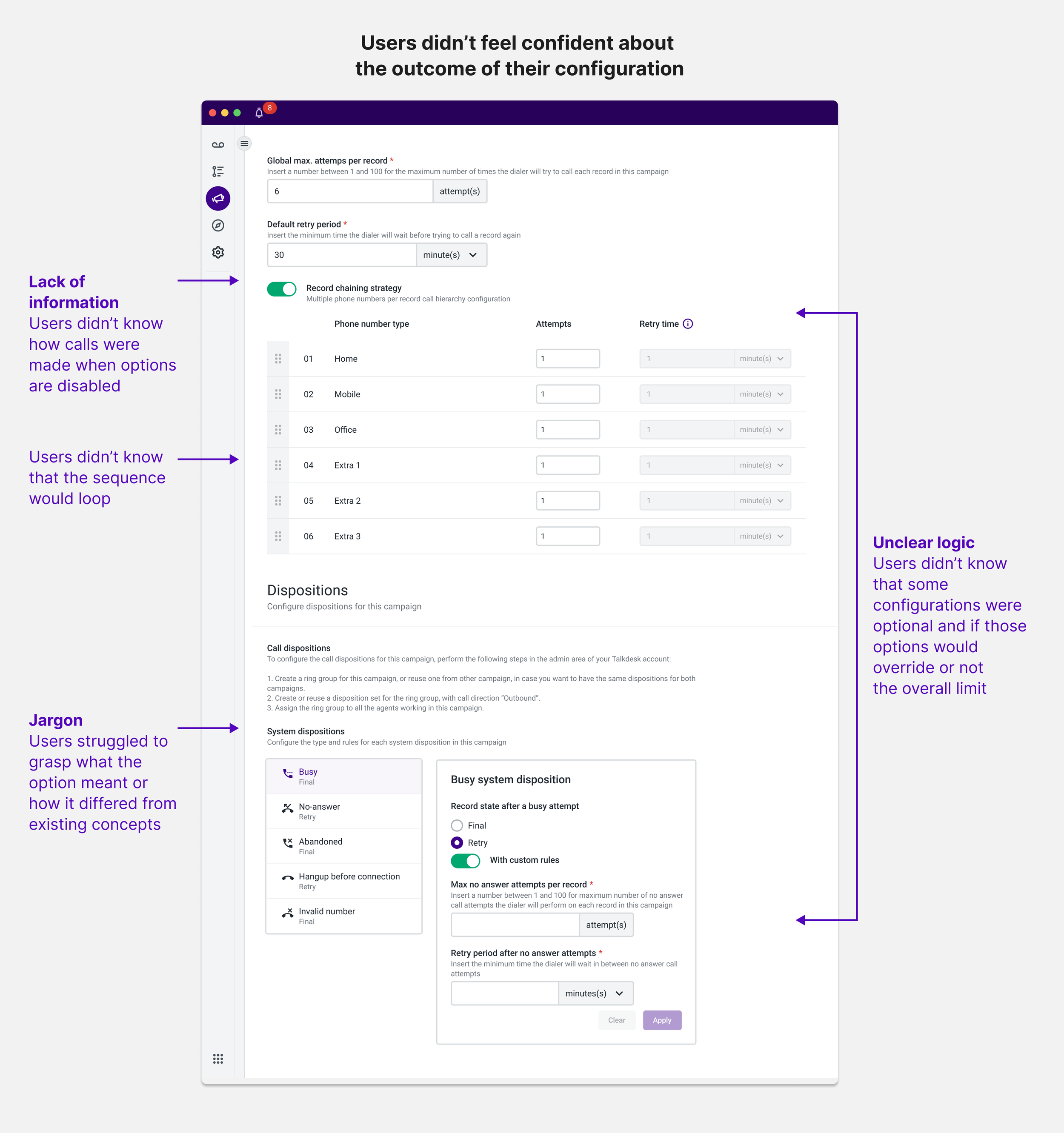
Incremental improvements were not enough
I first explored incremental improvements such as improving the copy and providing examples to address confusion. Usability testing revealed they had a minimal impact. The root cause of the problem was users struggled to see that options were first interconnected.
The entire user experience was too fragmented
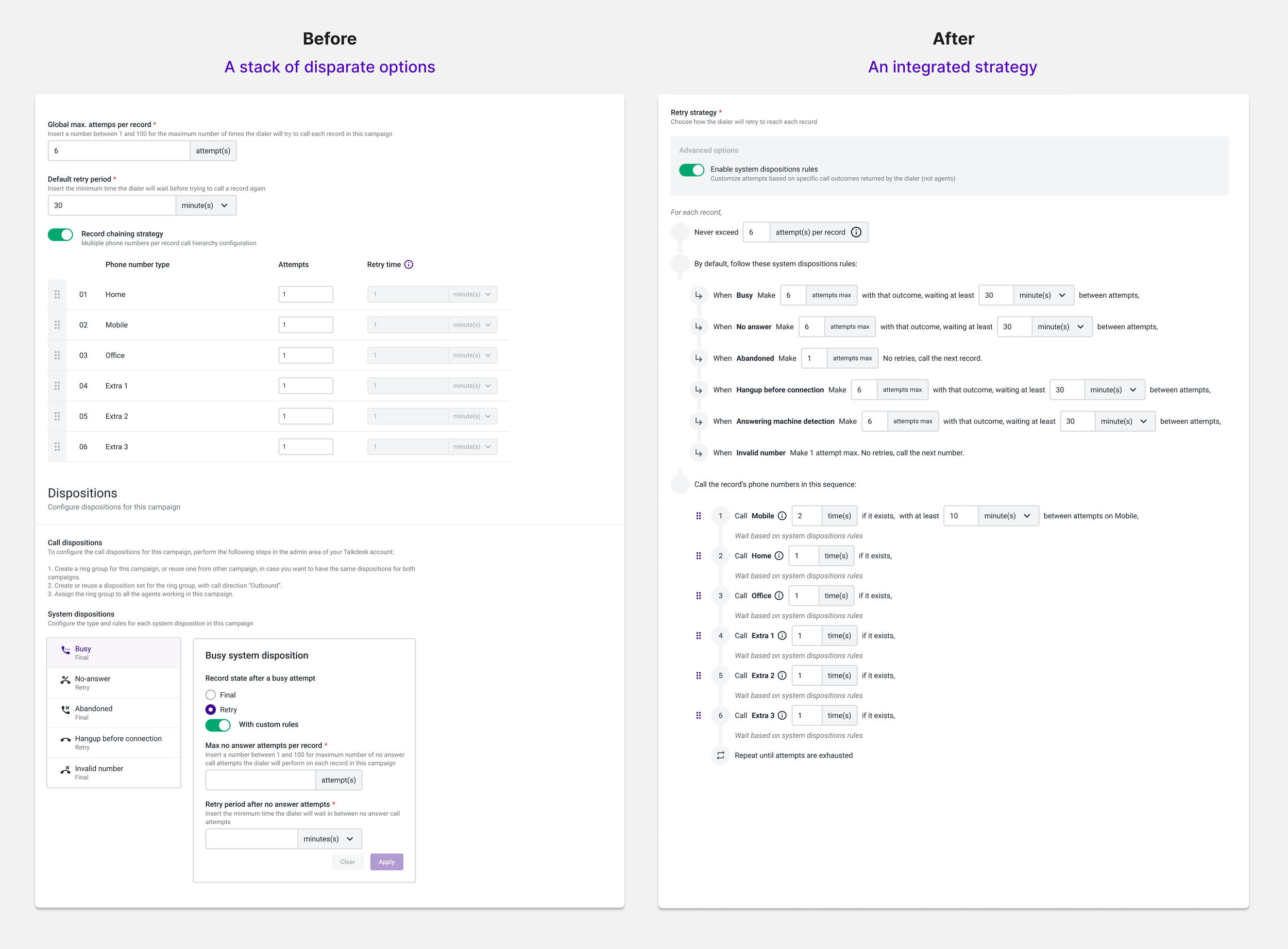
Over time, options were added incrementally without considering how they would work together. As a result, users saw individual settings, not a cohesive system.
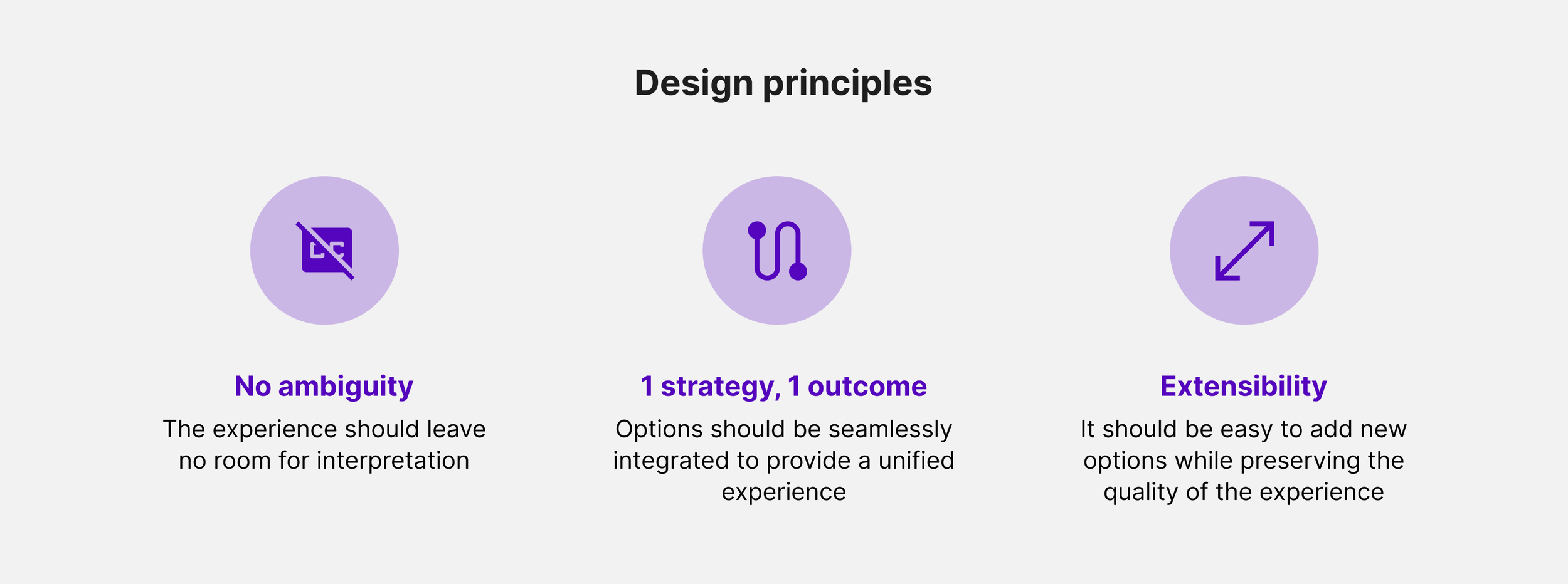
RETHINKING THE EXPERIENCE
Reframing the problem on a larger scale
Design by accretion reached its limit. The insight led me to rethink the problem on a larger scale, considering future capabilities. Knowing that customers requested more customization options meant the new experience needed to account for even more complexity.
How might we create a clear, cohesive, and scalable experience so users can make confident call strategies with the current and future customization capabilities?
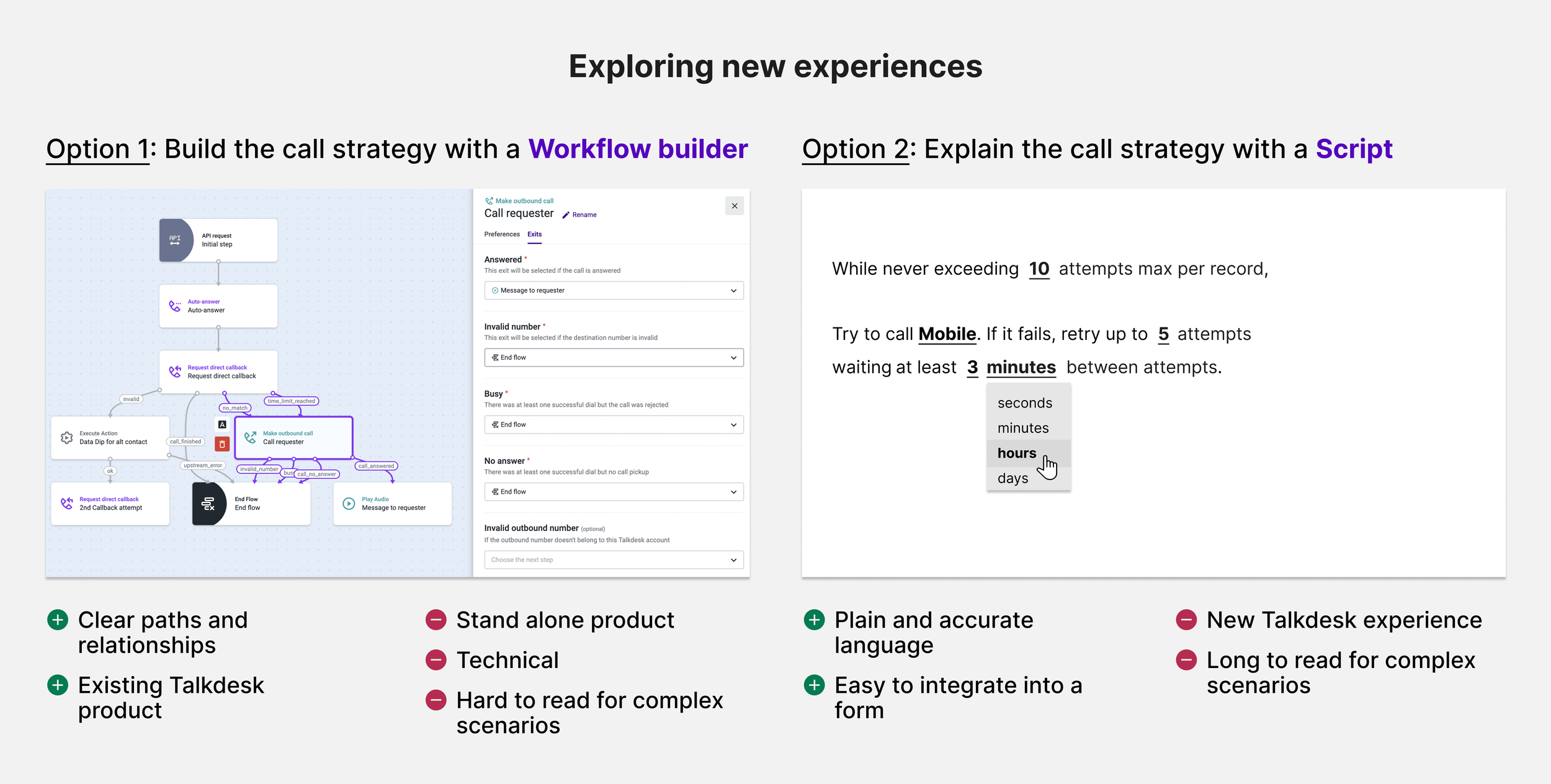
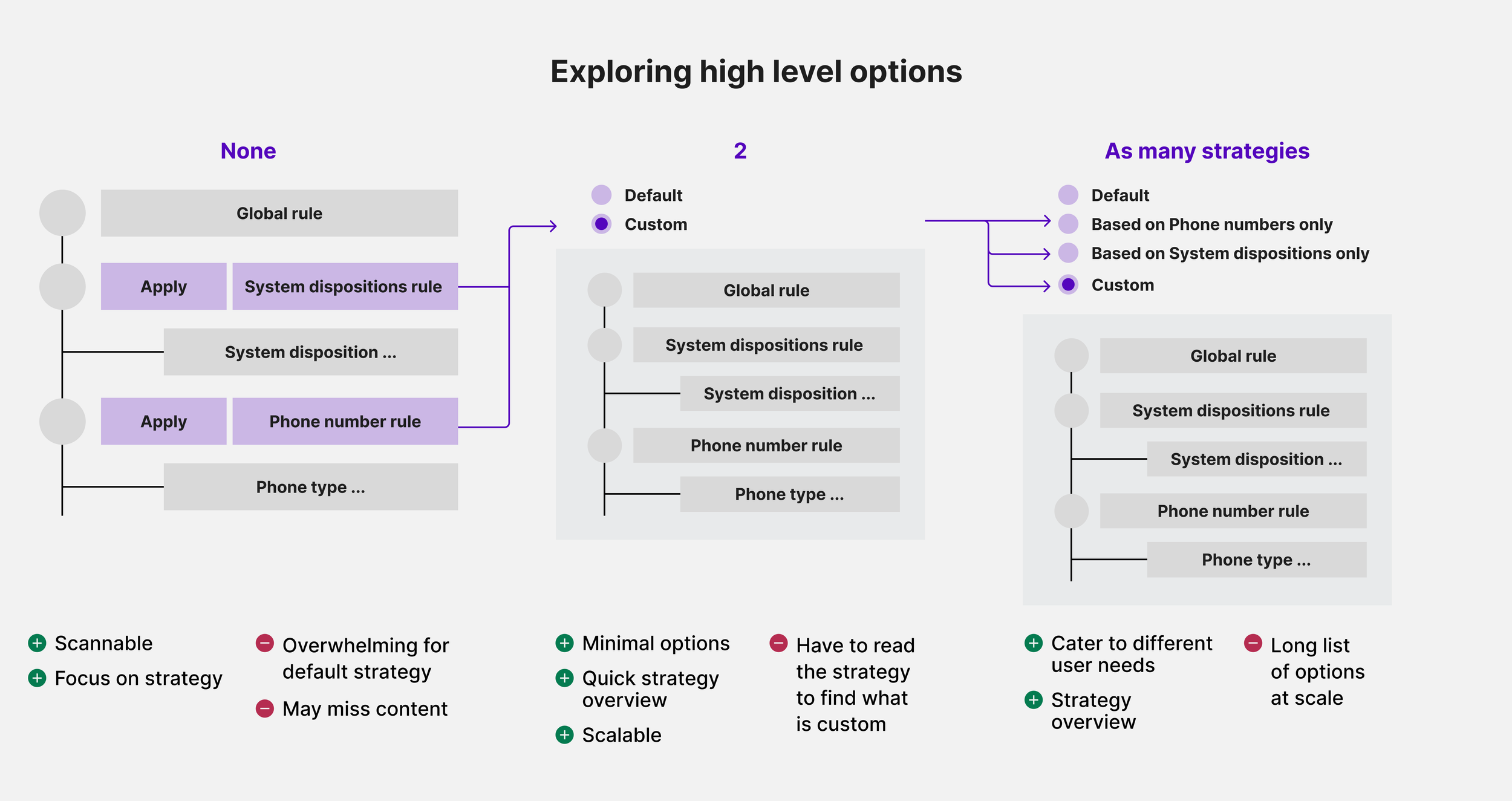
Exploring new directions: a sentence-based experience seemed promising but disruptive
2 main ideas stood out to help users understand how automation works:
a workflow builder, providing a visual logic
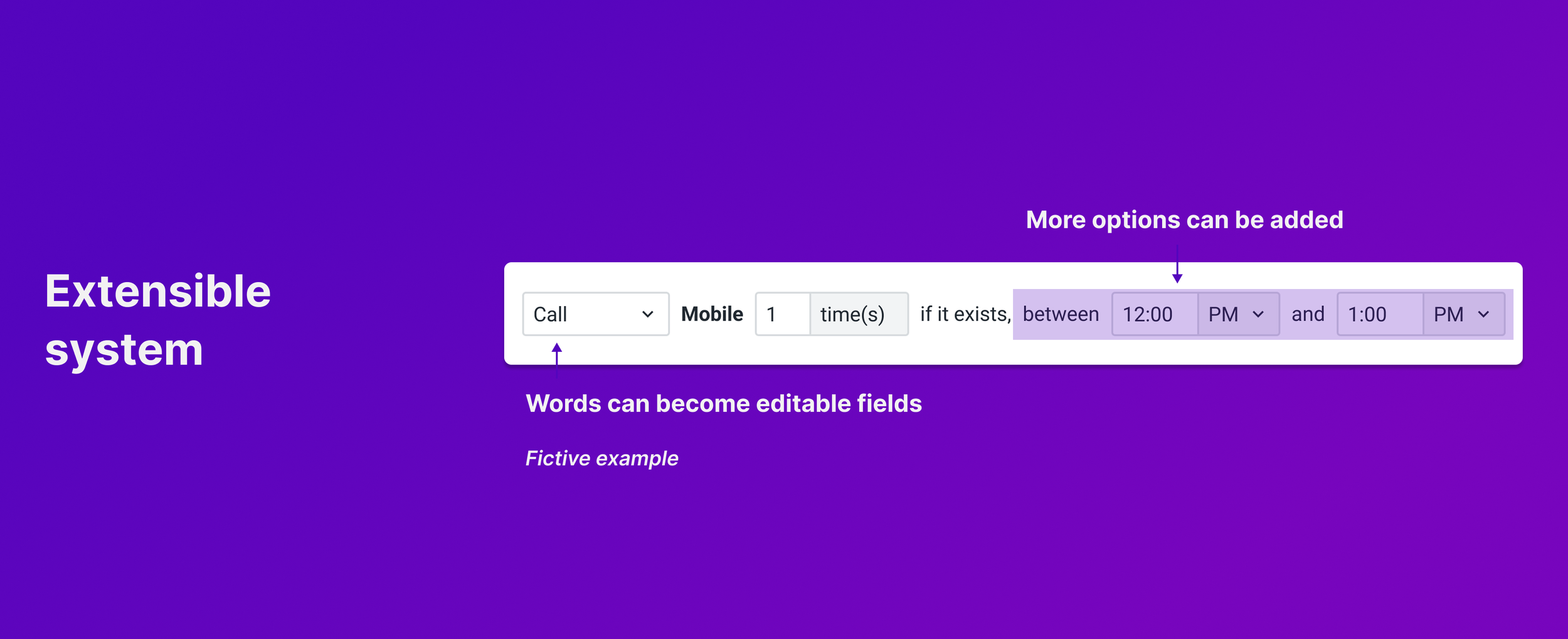
a sentence-based ‘script’, providing a readable format
We chose the script because it was easier to understand, required no learning, and seamlessly integrated with the existing experience. Then I refined the concept to make the experience less disruptive for users.
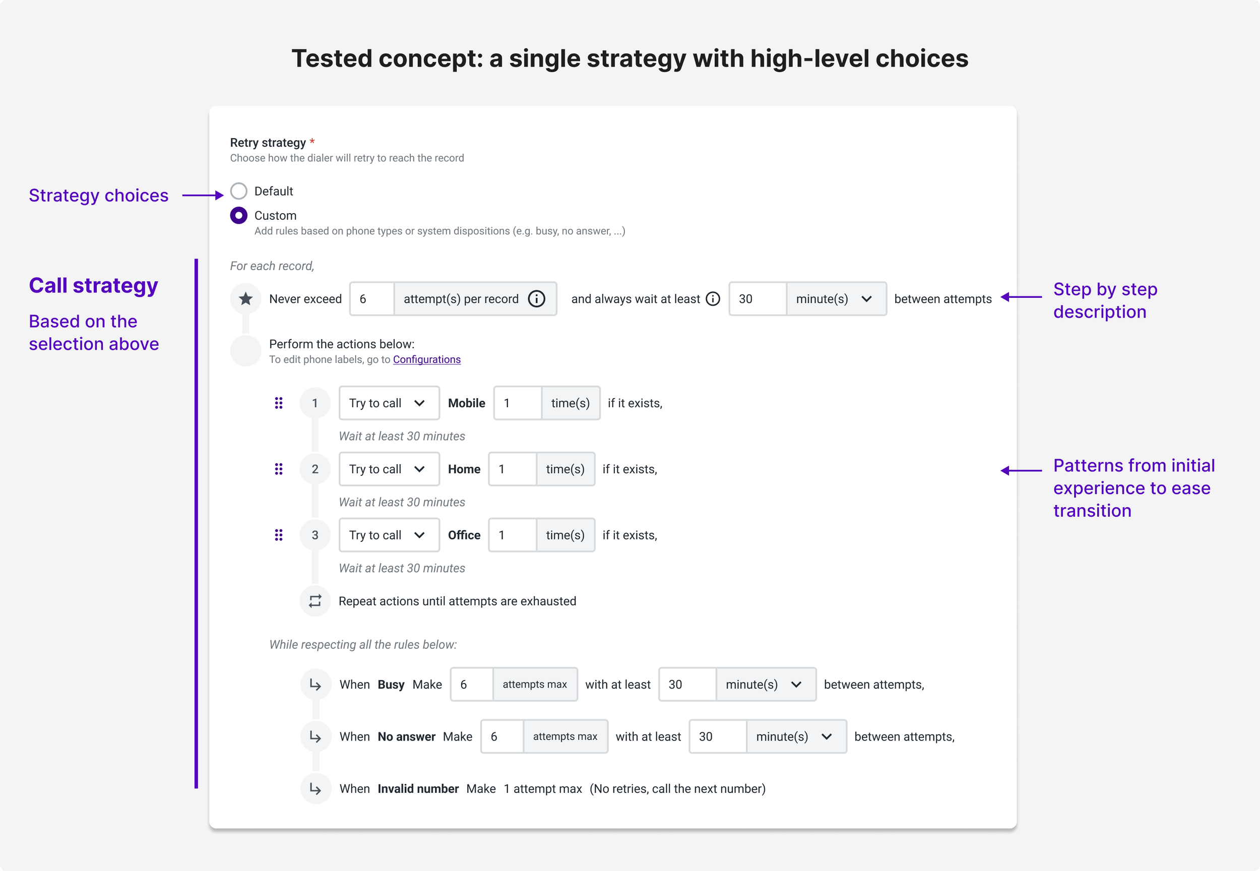
Testing: Previewing and reading steps removed confusion significantly
For the first time, usability testing revealed a breakthrough in user comprehension. Most users could now accurately predict how the Dialer worked in different scenarios. There was still some ambiguity but it was easily fixed by refining the copy. No major structural changes were needed.
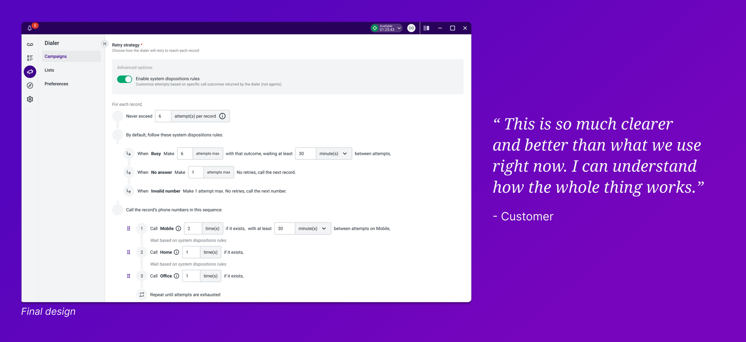
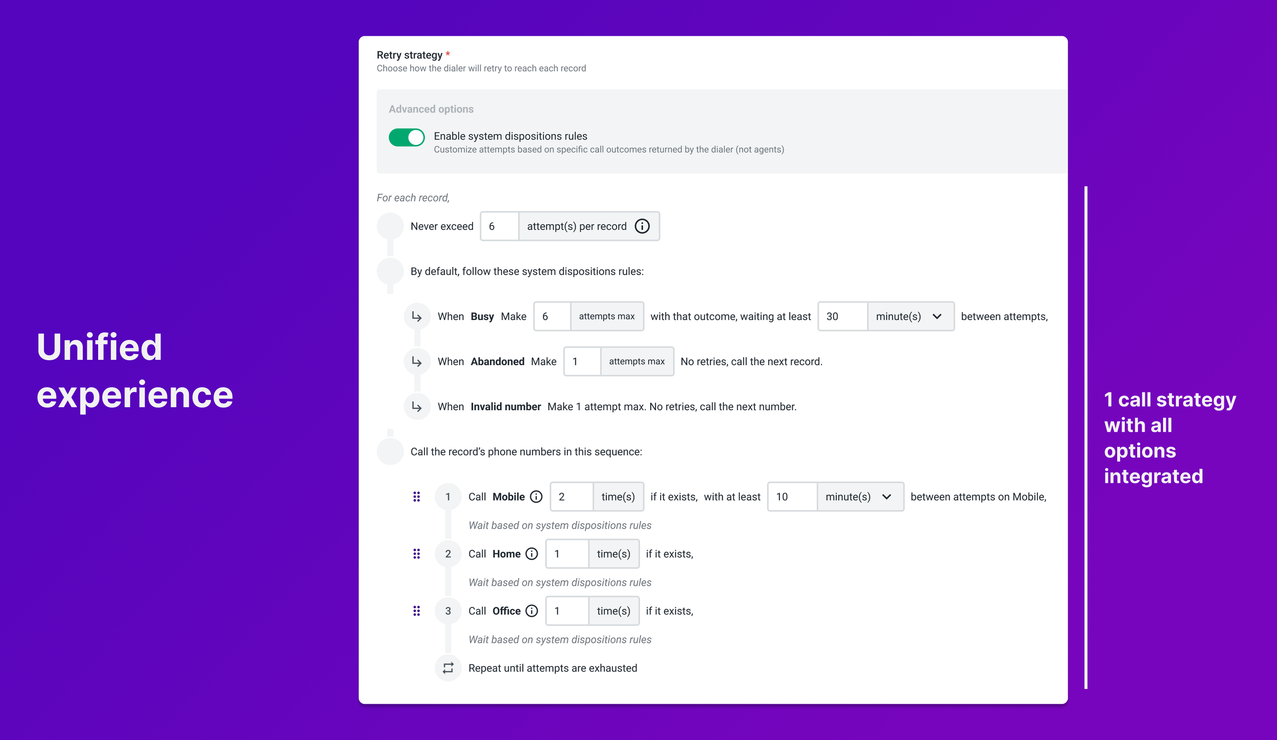
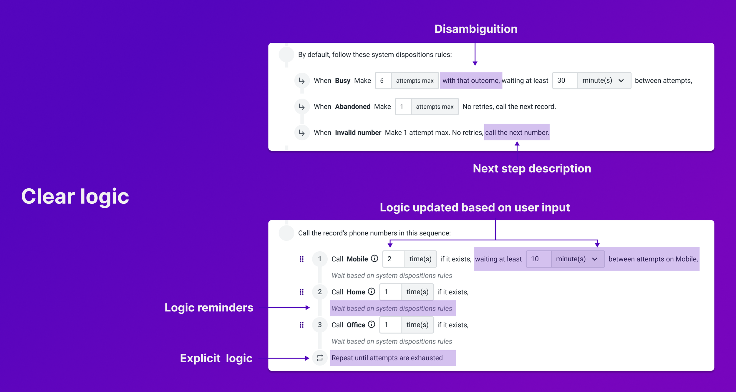
THE SOLUTION: WHAT YOU READ IS WHAT YOU GET
IMPACT
Metrics
Decrease of support tickets
Increase in adoption of customization options
Positive customer feedback
User impact
Customer confidence
“I like it, this is so much clearer and better than what we use right now. I can understand how the whole thing works.”
Internal team efficiency: an intuitive workflow
“This version is so clear, it follows how we do demos with clients. This is really helpful.”
Team impact
Pride for the solution
“That works really well. I absolutely love how this solution takes something piecemeal and makes it much more unified and flexible. This is very thought through.”
Perceived value in usability testing
“I’m happy we took the time to test with customers and internally. That’s not something we do. The feedback was helpful to get there.”